About the logo mark
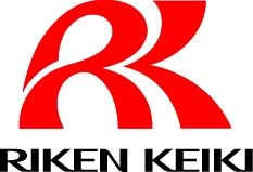
Logo mark of RIKEN KEIKI
As RIKEN KEIKI approaches our 70th anniversary, March 15, 2009, we have updated our Logo to better represent our Mission in the world. Our eternal theme is "to create safe working environments for people", and our policy is to react quickly to design and provide products needed to prevent industrial disasters.

Explanation of corporate color
Our corporate color is red.
Red is a color that means "warning". As a gas detection manufacturer, this color emphasizes that our job is to help warn others of danger. Red also means passion and motivation, which expresses the strong feeling of the RIKEN KEIKI employees towards keeping others safe.
Explanation of logo mark
A "Road" is the central theme of the new "RK" logo of RIKEN KEIKI.
The road continues onward pointing RIKEN KEIKI in the direction of our motto “To create safe working environments for people” for now and the future.
Three roads lead from the lower side of the logo towards the center.
-
The left road expresses connection.

This road expands upward and makes a circle. This connection means the connection of the company with the person, society, and the environment. -
The center road expresses support and security.

Support is expressed by the shape of the road. This means that we want to support any person who works in a dangerous place to keep them safe from harm. -
The right road points to the future.

This road uses our strong foundation to rise to meet the challenges of the future.
This means that RIKEN KEIKI will continuously meet future requirements to supply better and improved products to society.


